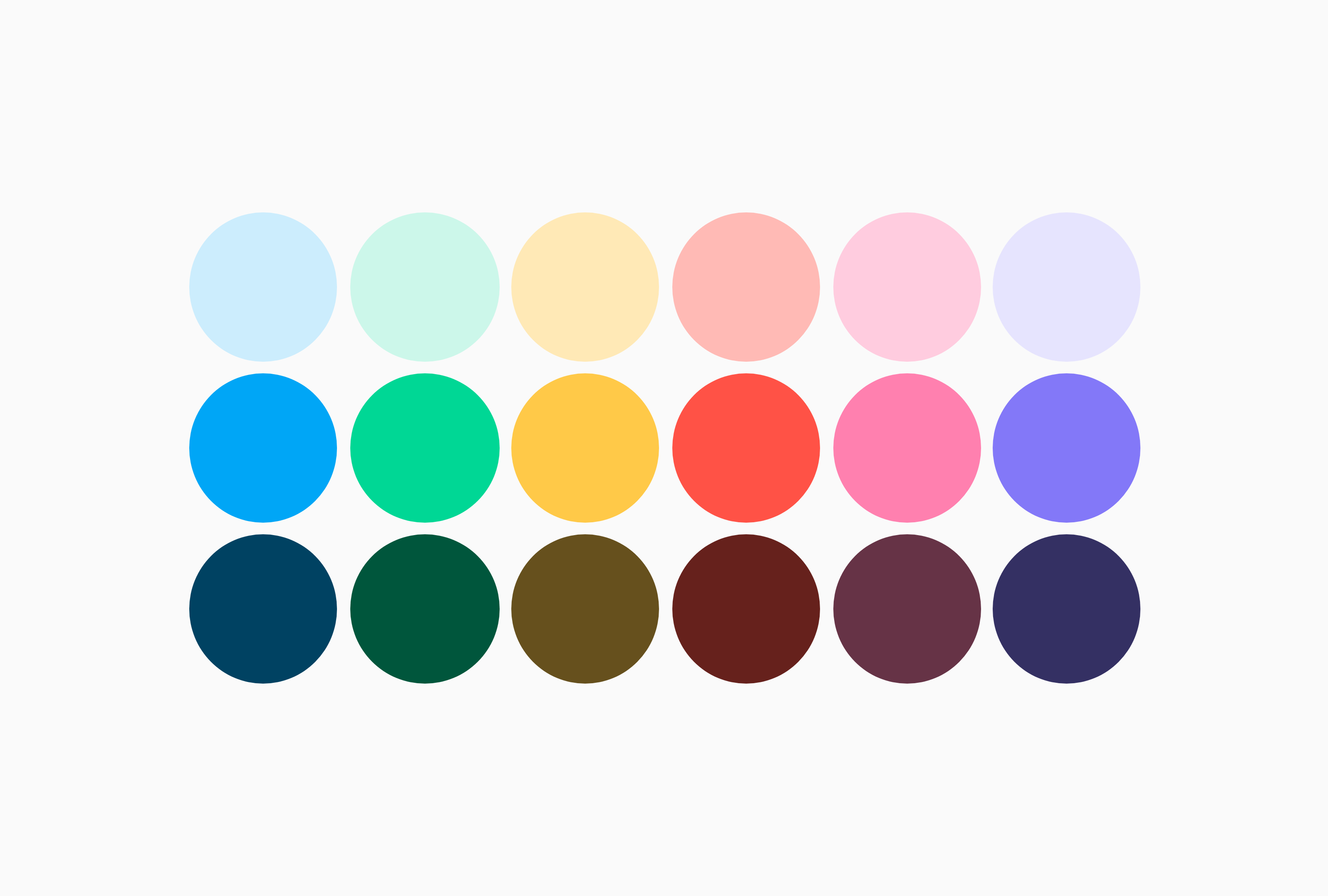
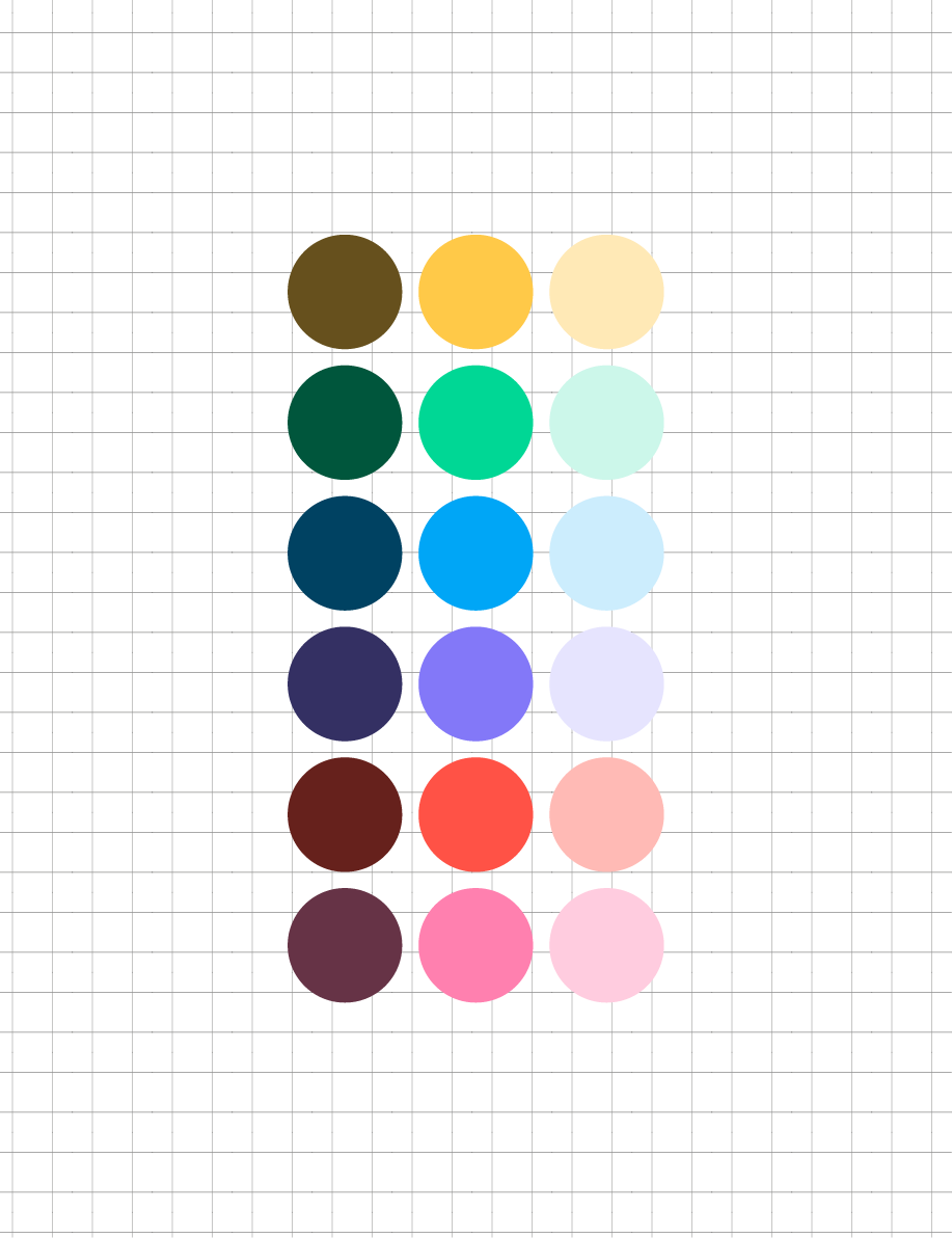
Skip to content

Wakelet Brand

Wakelet prides itself on being powered by humans. We celebrate human ingenuity and diversity and reflect this through an energetic and vibrant brand identity.

The word Wakelet is inspired by the wakes and waves we see in the sky and water. Just like an aircraft or sailing vessel creating a wake, your collections on Wakelet show the world where you’ve been, and where you’re headed. We make use of lines and patterns to reflect the energy, imagination, and playful curiosity of the people who use Wakelet.

Downloads

Group 20025
Download
Wakelet Logos

Download our logos in PNG, ESP and SVG formats.

Group 20026
Download
Colour Palette

Download a PDF including the official Wakelet colour palettes for use throughout your designs.

Group 20024
Link
Typeface

Link to download DM Sans, Wakelet's typeface of choice

Group 20027
Download
Graphic Templates

Download an adobe illustrator file containing our go-to layout templates

Guidelines

Images_Logo

Logo

The Wakelet logo is unique and custom made, when using it in your content please follow these guidelines:

  • Do not change or adapt the logo in any way
  • Do not change the colour or fill of the logo
  • Make sure the logo is large enough to be seen clearly with enough space around it
Download logos

Typography

When creating your own promotional content for Wakelet, use the google font DM Sans to keep things consistent, accessible and on brand. We recommend adjusting the typeface in the following ways for the best results:

  • Titles and subtitles should be set in -50 tracking
  • Body copy should be a minimum of 12pt
  • Typography should be dark when on light backgrounds, and light when on dark
Download DM Sans
Images_Type
Images_TOV

Tone of Voice

As an online technology platform that seeks to make it easier and quicker for users to find and share content, it’s only natural that our tone of voice is concise, engaging and authentic.

Our product is available worldwide and can be used across many industries and purposes, we speak to each audience differently but always with personality and clarity.

We don’t use jargon and we don’t hide behind complex statements. If it doesn’t sound like something you would say in person, delete it and start again.

Color

Colour is a key part of the Wakelet branding and is used to convey energy, passion, and power. With Wakelet Blue being the main colour of our branding, we used this as a foundation to build out a cohesive and playful palette that would work across marketing collateral and our product itself.

Our primary palette has been designed to encapsulate the tone of voice and characteristics of the brand, whilst representing the playful and energetic properties of our product.

Our light and dark palettes allow for more flexibility within our designs, avoid using these exclusively as it will make artwork look dull and washed out.

Download colour palette
Images_Color
Images_Icons

Iconography

We use iconography to support messaging and visual identity across both our product and marketing materials. Follow these simple guidelines to make the most of your icons:

  • Make sure the icon supports the message
  • Simple, clean icons reflect the Wakelet brand
  • Do not use heavily stylised icons or illustrations

Patterns & Shapes

Patterns play a crucial part in our brand, we use the wave throughout our graphics as both a tool for the narrative, and a representation of the energy, imagination and playful curiosity of the people who use Wakelet.

  • Use the background wave to draw peoples attention through your graphic
  • Weave the wave through images and graphic elements to create depth and interest
  • All shapes must feature rounded corners
  • Faint line-work can be added to backgrounds to add visual interest to plain graphics
Images_Shapes
Images_Photog

Photography

All photography used on content should be high quality, well lit and confidently composed. Depending on the type of photograph, there are a few guidelines that will help take your design to the next level.

  • Headshots should be taken head on and on a white background, whilst being high quality and well lit
  • Candid photographs of people using technology should look natural and focus on the person, not the device

Composition

Composition is integral in building consistency throughout brand graphics. We use a custom 9x9 grid system with a 55mm boarder in all of our content.

We have created a set of pre-made layout templates that can be downloaded and used for your own Wakelet graphics.

Download layout templates
Images_Layout
Images_Motion

Sound & Motion

We use sound and motion to help bring our media to life in videos and motion graphics. When creating your own motion content relating to Wakelet, follow these guidelines:

  • Motion should be natural, smooth and fluid - It should reflect the physics of the real world
  • Only use instrumental music in videos
  • Match the tone of the video within the production, how-to's should be calm whilst announcements should be lively and exciting


Sub-Brands

Sub brands are for internal use only, to request sub brand assets please contact the design team for permission.

There are three sub-brands at Wakelet, the community program, schools program, and the student ambassador program. The sub brands have been carefully crafted with specific audiences in mind and the following guidelines should be followed when designing for them:

  • Program badges are symbols of status for members - not logos to promote programs or courses
  • Use the correct colour schemes and gradients for each of the programs
  • Only design using these guidelines with permission from Wakelet
Images_Sub

Any questions?

Contact the Wakelet design team if you have any questions about the guidelines or assets listed above

Contact design team